
 Free Shipping*
 Secure Payment Gateway
 30 day Money-Back Policy
 Back to
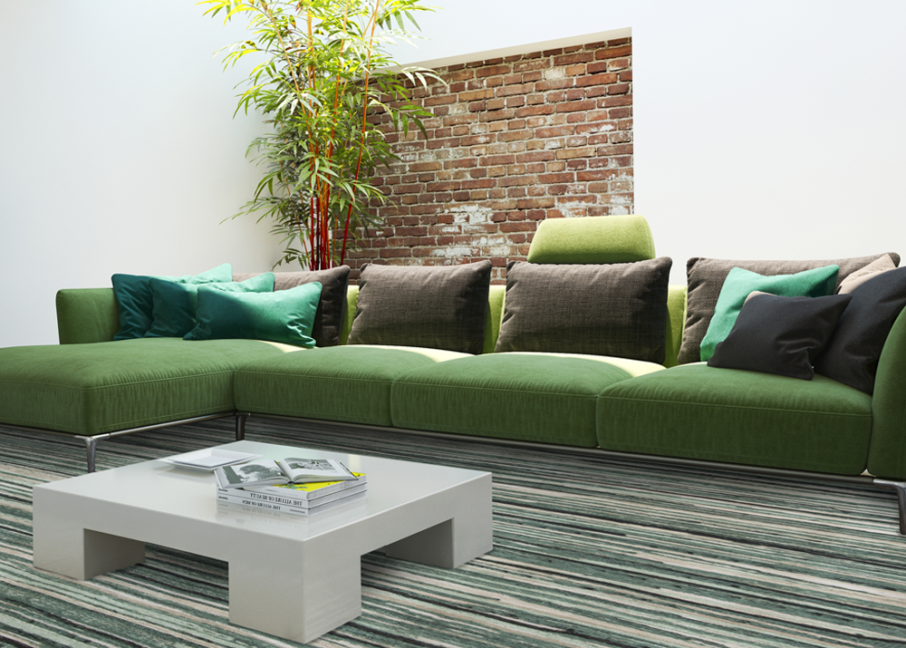
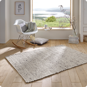
How to mix and match the colour tones of a rug
When buying a rug, it is important to check if the colour tones of this rug match the colour tones of your interior. You can combine the shades of your rug with the shades of your interior in various ways. Find out what these ways are in this article.
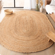
 Not the exact same shade of green but still a good combination: check out this vintage rug
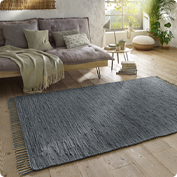
 A contrasting colour rug breaks up the interior and adds a bit of excitement; check out this rugs
Combine the colour tones with your accessories
Many people use the accessories in their interiors to carry through a certain colour scheme in their furnishings. The larger pieces of furniture have more inconspicuous colours, while the accessories in the home carry through a certain colour in the décor. If this is also the case for you, you can match your rug with these accessories. For example, if you have candles, vases, paintings or other accessories in a certain colour, make sure your new rug matches this colour well. This way, you can be sure that your rug will support the colour scheme of the interior and maybe even make it stand out more. Not the exact same shade of green but still a good combination: check out this vintage rug
The easy way
Do you put the new rug by the sofa and have cushions on it? Then you can use the following simple solution to make a good combination. For example, if you have cushions with shades of green and blue, it is nice if your new rug has the same colour tones. It doesn’t have to be exactly the same colours, as long as the colour tones of the rug are the same as the colour tones of the cushions on the sofa. A contrasting colour rug breaks up the interior and adds a bit of excitement; check out this rugs